Michal Reichmann provided a review (http://www.luminous-landscape.com/reviews/piezo.shtml) some time ago of John Cone's PiezographyBW system for printing black and white (grayscale) images. This was followed up with a further item by Vladimir Kabelik (http://www.luminous-landscape.com/reviews/printers/piezo.shtml). Since these reviews were posted there have been two significant developments with respect to this product:
1. A revised system, called PiezographyBWicc, no longer requires a Photoshop plug-in. Instead, new printer/ink/paper profiles have been developed. The user now, in principle, simply selects the appropriate profile for the inkjet, paper and printer he is using and prints as with any printer. Applications other than Photoshop can be used, but some method is needed to specify a printer profile. The application and printer driver may, or may not, offer the required ability. (The supplied profiles did not show up in the Color Management panel for PageMaker 6.5, or in the Epson 1280 ColorSync panel, but did for InDesign 2's Color Management dialog box.)
2. Inkjet Mall (http://www.inkjetmall.com/store/bw/1280-order-icc.html) now sells cartridges for the popular Epson 1280 photo printer. Previously, the only way to use a 1280 was to purchase the continuous ink system at a price of about US$725 and essentially dedicate a printer to black and white printing. This cartridge system is still a modestly expensive one with a required US$300 investment needed to get started.
I have wanted to print well in black and white for some time: ever since I realized that ink jet printers could produce near-photographic colour prints. That means since the Epson EX photo printer whenever that was. While I have been delighted by the colour printing capabilities of recent printers, I have been decidedly less content with grayscale printing. My discontent includes the results I have obtained with an Epson 2200, although I did make some progress with that printer recently. But I still have to compromise if I want prints from the 2200 to look right under both tungsten light and daylight. That's really another story, but the subjects of image colour and metamerism will arise in this review.
I have read several reviews of the PiezotoneBW ink set and all or nearly all have noted clogging problems. I thought I was ready for that. In any case, I would use my 3-year-old 1280 and I was prepared to sacrifice it if necessary. I discussed my plans with the folks at Inkjet Mall prior to making a commitment and was prepared to purchase a different printer if that were recommended. Their recommendation to me was to go with the 1280.
Clogging was worse than I'd ever imagined, but bear with me: there's good news here too!
I ordered the "1280 BW Starter Kit" with warm neutral inks and "museum black". I was not sure what was included with the "kit" and could not find definitive information on the Inkjet Mall web site. I was told when I placed the order that it contained the necessary software, one black cartridge, one gray ink cartridge, two flushing cartridges, a sampler of ten sheets of letter-size paper and complete instructions. I ordered two additional gray cartridges and one additional black cartridge.
The box arrived and I opened it. There was a bunch of stuff in there, but where was the "starter kit". I was initially convinced there had been some mistake. What I found were the five black/gray cartridges I expected, the sampler of paper, and one simple sheet of paper telling me how to install ink cartridges and profiles, and what settings to use when printing from Photoshop. There were two other boxes that appeared to contain non-matching, non-Epson color and black ink cartridges for printers I did not own. Where were the flushing cartridges, the flushing instructions, the printing profiles themselves and the promised detailed instructions? E-mail #1 to Technical Support. In reply: yes, that black cartridge for an Epson 890 and the color cartridge for a 1270 are the flushing cartridges for the 1280. The printing profiles are on a CD packed inside the paper sampler, the detailed printing instructions are in a PDF file on that same CD, and the flushing instructions are included as an attachment to this e-mail! These "flushing instructions", not included with the "kit", contained essential critical details on how to remove partially full ink cartridges from a 1280 and save them for re-use.
You may note a certain inconsistency in what I call various parts of the system: the ink cartridges themselves are labeled "Piezotone" whereas the system is called "PiezographyBWicc".
OK, I removed the Epson cartridges, flushed, installed the Piezotone cartridges, installed the profiles I expected to use, and ran a nozzle check. After about four cleaning cycles, I obtained a 100% nozzle check. I followed the printing instructions to the letter using Epson Enhanced Matte paper and produced my first too-dark print. I tried two other papers from the sampler pack together with their respective profiles, and got two more too-dark prints.
The printing instructions are quite detailed and nearly complete. They make a significant point, stressing that the gamma and profile associated with one's existing image files may not be what one thinks they are. In order to be sure, one must discard the existing profile and assign a Gamma of 1.8 ("the Printing Standard"). Well, I've been using a gamma of 1.8 since 1989. I am quite sure my files are 1.8 and my monitor is calibrated. But I discovered that if I converted my files to a gamma of 2.2 and then assigned a profile for a gamma of 1.8, I got a decent result! Frankly, I believe the profiles are 'off'. (The manufacturer seems to agree: shortly after doing this review I received revised profiles in the mail. I have yet to try them.) A better solution, at least when printing from Photoshop, is to use the Custom Dot Gain feature of Photoshop as described by Michael Reichmann in his review. In my view, this use of the custom dot gain to fine tune the system should be included in the otherwise quite complete instructions.
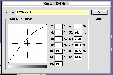
Here's the Custom Dot Gain curve I used with the PiezographyBWicc system and Photoshop. This curve probably over-does the needed correction. I arrived at this curve by printing grayscales, not real images. Actual on-screen images needed to look about as dark as possible and still detect shadow detail in order to print appropriately. I also developed other curves by using actual images but the problem with that is that the ideal curve for one image will not necessarily suit another image. Using the grayscale approach I at least arrived at a result that seemed to work about the same way for most images.
Having now produced a decent print, I was initially surprised by the image colour. I thought it was much too yellow. I had hoped that "warm neutral" would mean a nice slightly reddish black. Then the next surprise: I decided to compare image colour directly with some real silver-based black and white prints. They were even more yellow! Compared to my 'real' black and white prints, these inkjet prints did indeed look slightly red! I had never realized before just how critical the human eye can be or how it works. Part of my problem was the choice of paper. The Epson Enhanced Matte paper is simply too white for this warn-tone ink, in my opinion. It also seems to have a tendency to turn gray ink slightly yellow. (I have since seen Enhanced Matte paper do this with other inks also.) The paper base of my 'real' prints was quite yellow in comparison with Epson Enhanced Matte. And I was amazed by the variation I now saw in my older prints depending upon the paper, developer and toner (if any) used. I had always simply accepted whatever result I got without really questioning or comparing. A trial with Epson Watercolor paper gave me was a more satisfactory result. The Watercolor paper is only slightly yellow in comparison with Enhanced Matte, but to my eye, it makes a significant difference. There is no profile provided for Epson Watercolor paper; the Enhanced Matte profile seemed to work fine.
I did try two other of the supplied papers but was not really happy with those either. I did want to get on and make a few 12 by 18 inch prints and I had only two choices in the short term: Enhanced Matte and Watercolor. Needless to say, I used Watercolor for the serious printing. I still used Enhanced Matte for test purposes: to confirm image density and contrast, for example, before making a 'final' print. I also tried Epson's Photo Quality Ink Jet paper. Although this paper is quite white, the ink colour looked significantly different than on the other papers and the result was quite pleasing. Although I think this was the best result I achieved colour-wise, I did not pursue this route because the paper is so thin and tends to wrinkle.
Near my printers I have a fluorescent desk lamp. The purpose of the lamp is primarily to see inside the printers for cleaning purposes and such. Needless to say, however, that lamp often influences my initial impression of an image's colour. In all the previous printing I have done, that lamp has provided essentially the same impression as does tungsten lighting. In the case of PiezotoneBW warm neutral ink on Legion Concorde Rag paper, however, I was initially amazed at what I saw. The print looked like what I find in the waste bin the morning after a black and white printing session when I have misjudged things so badly that the print went directly from the developer tray into the waste bin. Under true daylight, however, this print looked fine. I conclude from this that metamerism can affect the apparent colour of the paper stock as well as that of the ink. I cannot say there is no metamerism with these inks, but, except for the result on Legion Concorde Rag, the effects I saw were so small as to be insignificant.
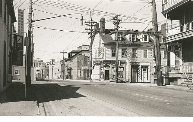
Here's a scanned sample of the result on Epson Enhanced Matte paper - a result I thought too yellow
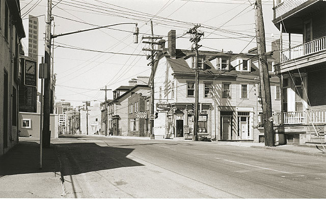
and the same image on Epson Watercolor paper. Not sure what people will see on their monitors they eye has strange sensitivities they will probably look much the same. Yet to my eye the one print is acceptable and the other isn't. This photo was taken at the corner of Hollis and Morris Streets in Halifax, Nova Scotia during a February afternoon around 1982 (plus or minus two years). The camera was a Leica M5 with 6-element Summicron 35/2. The camera was hand-held, set for 1/30 sec at f/8 with a yellow filter. The film was Ilford PanF developed in Kodak's Microdol-X. I don't recall the developing time the required time seemed to change over the years somewhere between eight and thirteen minutes! The negative was scanned recently using a Minolta Scan Elite 5400. The print was scanned using an Agfa T-2500.
I made lots and lots of prints mostly testing and getting things right. But I also made 5 quite satisfactory 12 by 18 prints and was feeling very comfortable with the process when the first 'color' (gray) cartridge ran out. All in all I got more prints out of this cartridge than I had expected. I didn't keep a really accurate record, but the area covered was equivalent to about 35 8 by 10 inch prints.
The physical cartridge change was no problem; it was just like changing colour cartridges. The all-important nozzle check indicated problems, however. One de-clog cycle, two, three... not much improvement. Put in the messy flushing cartridge and flush. Re-install the gray cartridge. One de-clog, two, three... Finally a good nozzle check and I'm off and running. I make a print or two. More de-clogs. Finally I decide things are ready for a serious print. A final check of the image at 8 by 10. There's something wrong: the lighter tones have suddenly become too light. Abort the print and do another nozzle check. One of the lightest inks (there are two tanks used for each of the two lightest grays) is completely blocked! Not a mark from the ink in one of the tanks. More de-clogs, more. Let the printer "rest" over night. More de-clogs. Finally I am convinced that this one tank was simply not completely filled to begin with. I can continue to work with things as they are. With one of the two lightest-ink tanks still working perfectly there are no obvious streaks in the print. The only evidence in the print is that the highlights are too light. Well, we can fix that in Photoshop can't we! So I continue printing until the printer's red light comes on. Got, at best, one-third the coverage as from the first cartridge.
I eagerly install cartridge number three, hoping all will be restored. Well, that one lightest shade is not restored after six de-clog cycles. I re-commence to print as I had been darkening the highlights in Photoshop in order to compensate. Two inches in to the next 8 by 10 the second tank holding the lightest-gray ink becomes blocked. Six de-clogs and no change!
Time to e-mail Tech Support again. Dana encourages me not to give up: there are solutions for even the worst clogs. I am sent about six pages of instructions. Most of the things I had already tried: Windex on the print head, Windex in the print head, Windex on the pad that caps the print head when the printer is off. I had even re-installed the Epson colour ink! I did it because I had given up on printing black and white with Piezotone inks. Dana said to do it because the Epson inks declog the Piezotone inks! And sure enough it worked! I got a clean nozzle check after about two days with just a declog cycle or two every six hours or so, and some intensive cleaning of the exterior of the print head.
With the remainder of the Piezotone ink in the third cartridge, I printed the equivalent of about 22 8 by 10s not bad all considered. Not all went swimmingly, nevertheless. Several prints showed intermittent ink flow problems. On close examination one can find portions of the images where there are striations missing ink. But from a normal print viewing distance these are invisible. About half the prints are usable. A few are perfect. One is perfect except for the last 3/8 of an inch which can easily be cropped off.
I would assess that three of the images I printed yielded the best prints from those three negatives that I have made by whatever process. One additional image is the equal of a platinum-palladium print that I consider to be my best result with that process. So clearly, yes, this system works well when it works. One image I had hoped would yield a stunning image fell somewhat flat. But then this is must be a strange image: the best print I have of it was done on a laser printer of all things! (I used very special 100% cotton paper, mind!) The same image had also failed miserably in my attempts to print it on Platinum paper. I'll have to work on this one some more.
Apart from the print quality, there is actually other good news in this story. Much of what I am about to say is speculation, but my experience is consistent with the following explanation. Inevitably when using ink jet printers, a certain amount of semi-congealed inks is formed where the ink cartridge connects with rest of the printer. Some of this gets into the ink stream whenever cartridges are changed. The Epson inks seem to contain some solvent that is able to dissolve these 'clots'. The Piezotone inks seemingly lack this magic ingredient. So I reason that switching back and forth between colour and gray inks is not necessarily a bad thing to do. I am duty bound to point out, however, that this method of operating is NOT condoned by Ink Jet Mall. They maintain it is necessary to flush between different types of cartridges.
What about that messy flushing, ink contamination etc.? Well, my observations suggest that flushing was completely unnecessary. Never once when I switched cartridges did I seen any ink contamination. I saw no color in the initial flushing. I saw no gray ink in the subsequent flushings. I never saw any gray ink in the nozzle check immediately following a switch from gray to colour, and I never saw any colour tints in the grays after switching from colour to gray. It appears to me that the 1280 (this may not apply for other printers) effectively flushes itself with the new ink anyway whenever a cartridge change is made. Very little ink seems to be 'stored' in the print head. This seemed to be true even while I was having major clog problems.
Thus my experience admittedly brief and incomplete suggests that with this PiezographyBW cartridge system for the 1280, it is entirely reasonable to make temporary switches from colour printing to black and white. It is not necessary to dedicate a printer to black and white printing. In fact that may be just the wrong thing to do. That gray ink will clog unless the printer is kept completely clear of congealed ink and is used regularly like every day.
There is a trick required when changing cartridges that are not empty. To remove a cartridge that has a useful amount of ink left in it and still be able to use it, the cartridge must be removed from the printer while the printer is unplugged. So the procedure is: push the yellow button to move the carriage to the ink-change position. Unplug the printer. Remove the cartridge, clean the areas around the vents (on top of the cartridge) and around where the ink leaves the cartridge (where the seal on the bottom was still is, but now it is punctured) and tape over these areas to prevent air from getting in and drying out the remaining ink. Insert the new cartridge and clamp down the cartridge cover. Plug in the printer. The carriage will now automatically move to the right and start the ink charging process. If a cartridge is removed while the printer is plugged in, that cartridge will be electronically marked as empty.
It became clear to me that the Piezotone inks must be more viscous (thicker) than the Epson inks. This means the ink naturally flows more slowly. The PiezographyBWicc instructions call for uni-directional printing that means the printer only squirts ink when the carriage moves from right to left. Although I did not try bi-directional printing, I suspect it would cause trouble. My observation is that printing quality seemed to improve when the printer was 'given a rest' between prints or after a de-clog. My interpretation is that the flow of ink behind the print heads is 'catching-up' with the demand during these rest periods. An alternative explanation might be that the Piezotone cartridges have an inadequate venting system. Yet another observation is that I was never able to get any Piezotone ink out of a cartridge by shaking it or rapping it sharply against a table. I could get ink out of an Epson cartridge in this manner.
I believe that the PiezographyBWicc black/gray ink system is a serious candidate for fine black and white photographic printing. Between the flexibility offered by image editors like Photoshop to match the tonal scale to the needs of an image, and the ability of an Epson 1280 to apply the Piezotone inks to piece of paper, very fine results can be achieved. I witnessed much cleaner shadows that I could ever have achieved with conventional materials. (I admit this reflects on my abilities to manipulate the conventional photographic printing methods!). Keep your b&w image files at 16 bits per pixel if you can this helps keep those shadows clean. There remains a difficulty with texture or detail in highlight areas. The half-toning methods used by ink jet printers characteristically offer high resolution in areas of high contrast and poor resolution in areas of low contrast. This is done deliberately to preserve image sharpness while also retaining smooth transitions in areas where the tones are changing slowly. To do otherwise would probably lead to posterization in the gradients. Ultimately this highlight or low-contrast detail problem will be cured by having significantly higher-resolution printers. The only way around this for now is to make one's prints larger!
Bear in mind that, for now at least, this is "bleeding edge" technology. Using this PiezographyBWicc system reminded me a lot of the beta-testing I did years ago for a pre-Photoshop black and white image-editing application called Digital Darkroom. It was frustrating, infuriating and down right tiresome, but I could do things that I had never been able to do before. And that made it worth while.
I consider this black and white cartridge system for the Epson 1280 to offer an opportunity for digital photographers to try-out black and white printing at moderate expense and without having to make a dedicated hardware commitment. You can have your colour printer back after the trial. And you can return to black and white printing when you need to do it again.
I would like to thank Dana Ceccarelli and others at Inkjet Mall for their advice, assistance and encouragement. Without Dana's encouragement I expect I would have given up completely and considered it all a bad dream.
Back to Digital Black & White page.
Back to Main Page Table of Contents.